Zoom Visual Identity
COMPANY
Zoom
Year
Q2 2022 – Q4 2023
TEAM
In-house
Role
Design lead
SCOPE
Logo redesign
Color & Typography
Iconography
Graphic systems
Design strategy
Brand guidelines

Zoom is an all-in-one intelligent collaboration platform that makes connecting easier, more immersive, and more dynamic for businesses and individuals. After their explosive growth, Zoom was looking to rebrand themselves from a meetings company helping the world get through a pandemic to a communications platform leading the future of hybrid work.
As a visual storytelling and branding specialist, I was brought on to Zoom’s brand design team help foster a visual identity redesign and build up their entire design kit of resources. The rebrand initiative was underway before I joined, but the visual identity effort had hit a roadblock.
I was able to audit and evaluate Zoom’s business goals and put together a comprehensive visual system that would scale. In the course of 4 months, I reset the design initiative and pushed out a new visual identity on time for their fall rebrand campaign launch.


Logo redesign
I redesigned the wordmark to have a more fluid visual tracing experience for each character. The integrity of the original wordmark’s distinctive stroke ends was kept, while corrections were made to the character heights to improve the typographic balance.
This new wordmark would serve as an visual anchor for the platform as it was used for an entire brand architecture and logo lockup system that I led for each of Zoom’s sub-brand offerings.
Logo mark (concept)
Previously, Zoom had been using the video icon as their logo mark for the company. With the rebrand focused on reintroducing Zoom as a full communications platform, I explored several iterations of a new icon to represent the new Zoom.
Ultimately, leadership chose to scrap this exploration and we moved forward with the wordmark being the sole logo asset for the brand.
Color
When creating the full color gamut for Zoom, I wanted to capture a sense of warmth and humanity. The color system is directly inspired by the sun’s energizing impact on the world around us.
A broader spectrum was defined by a scale of neutrals that transition from warm lights to cool darks to mirror our experience of light throughout the course of a day. Select tonal values were then curated from that spectrum to create primary and expanded brand palettes.
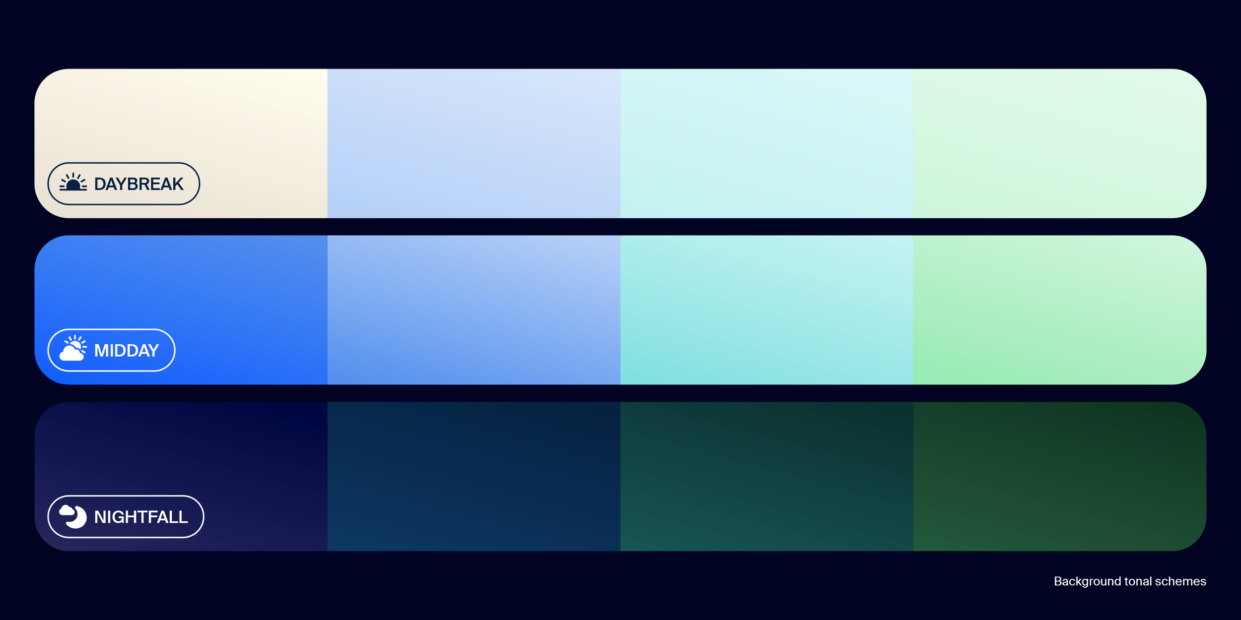
A color system was introduced to bring distinction to designs and provide a framework for our visual language. Part of this system included three foundational color schemes, continuing the metaphor of light experienced through the day cycles.

Typography
We approached our typographic system with two primary considerations – lead with an approachable personality and follow up with an accessible function that ensures clear content navigation.

Happy Display is Zoom’s expressive typeface that is used as the display font. It’s based on the font, Internacional by Latinotype. We worked directly with the original font designer, Luciano Vergara, to evolve the font slightly to further embed distinction for the brand. Its bowed letterforms promote a feeling of joy and harken back to Zoom’s culture of delivering happiness to its customers.
Almaden Sans is Zoom’s utilitarian typeface that is used as the brand’s system font. It’s a repackaged version of the font, Suisse Int’l by Swiss Typefaces. It combines classic style with versatile design qualities that cover all basic needs across the organization.
I created a third, custom brand glyph library for specialty programs scenarios. These letterforms took direct inspiration by the unique qualities of our wordmark, introducing a thinner weight that retained the fluid and tapered stroke lines.


Iconography
Our platform leveraged a specific set of icons and creation guidelines. In order to build a cohesive visual language for the user across marketing and product experiences, all marketing iconography was redesigned to maintain the precedence set by the product. Nearly 500 icons instances were assembled, each with a fill and outline version.

Graphic systems
The shape system was inspired by the harmonious fusion of form and function experienced across Zoom’s unified platform. The framework for our graphic elements were build using various Venn diagram configurations – representations of collaboration and shared experiences. These elements were extracted to create a library of soft shapes, patterns, and circle configurations that would be woven throughout the entire visual identity.


Brand guidelines
Alongside the creation of the visual identity elements, I was also led the development of the brand guidelines. This encompassed the definition and instruction of use for all elements, as well as the ideation and strategy for brand mission and design principles. The guidelines were published as an interactive pdf and Figma prototype, and in some regions we localized the content to ensure it was accessible for our global employees.


SUPPORTING CREDITS
Creative Management
Brandon Realmonte
Graphic support
Kenya Bravo
Sean Christensen
Max Point
Chris Reyes
Nick Wenzel
Animation support
Sean Coey
Documentation support
Lauren Reed
Typography
Latinotype
Swiss Typefaces